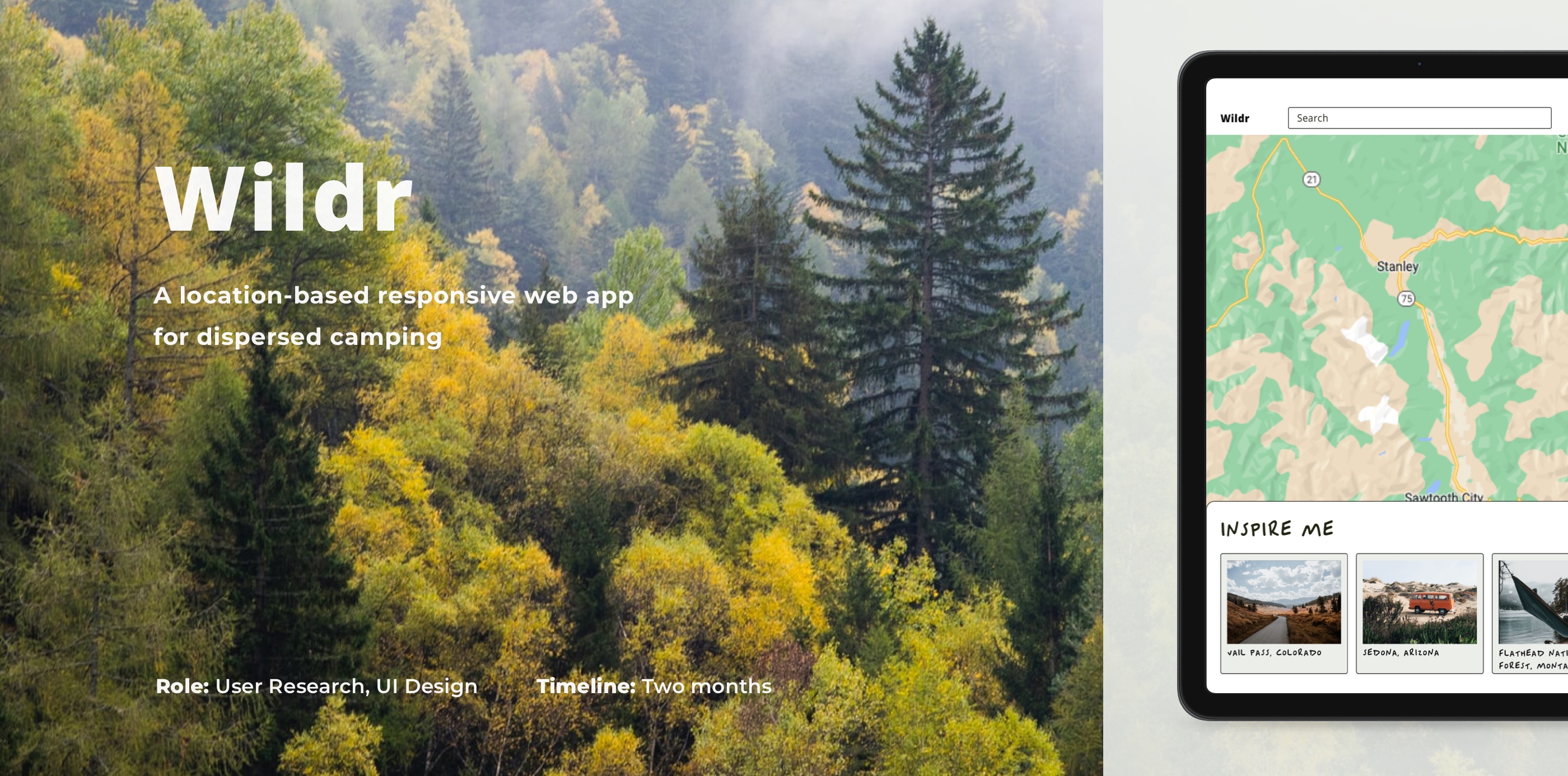
Wildr
An App For Dispersed Campers
The Problem
People are, more than ever, aware of the benefits of wilderness on your wellbeing. Flocks of people head towards the mountains and forests in search for some peace and quiet, and to escape the stresses from life.
Current camping apps often focus on established campgrounds. Sites are often labelled inaccurately making the search for dispersed campgrounds difficult.
The Solution
Dispersed camping on public land is a great choice for those without a plan or for those looking to immerse themselves in nature.
I will research and create an app specializing in dispersed campgrounds to equip campers with the knowledge and confidence to go wildr.
User Research
User Interviews
I created a script for remote interviews using open questions. I recruited three participants who are keen campers with different demographics and conducted user interviews with the aim of gaining meaningful insights into the needs and wants of potential users.
Results
After the successful user interviews, I compiled and synthesized the results to recognize patterns and determine pain points. The following user personas were created from my results.
Craig
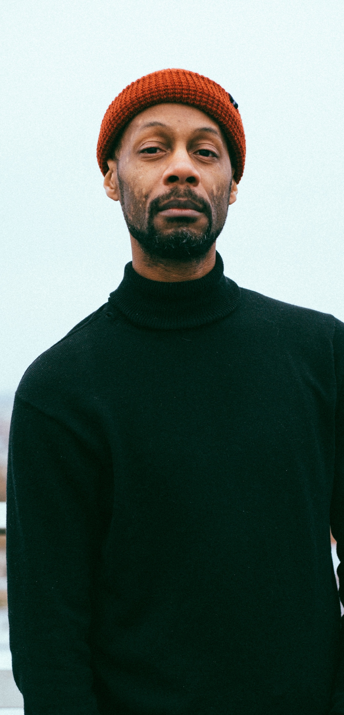
About
- Age: 25-34
- Status: Married
- Location: Rockville, MD
- Occupation: Project Manager
- Interests: Mountain biking, cooking, travelling, music, video games
Personality
- Adventurous
- Planner
- On the go
Quote
Looking for a campsite close to hiking trails, fishing, and other activities. The closer the better.
Goals
Craig is looking for campsites close to water and activities but far from crowds. He is an adventurer who has a full-time job and has limited time on the weekends. He likes to have idea of what he is doing by carrying out some research before his trips and therefore making the most of his time.
Pain Points
Camping on the weekends means he camps when a lot of other people are doing the same thing. He wants a quick way of finding dispersed camping grounds that are not near people but also close to activities.
Kara

About
- Age: 25-34
- Status: Single
- Location: Ketchum, ID
- Occupation: Personal Assistant
- Interests: Hiking, skiing, baking
Personality
- Spontaneous
- Flexible
- Minimal
Quote
I am not much of a planner but finding new remote places could be useful if things get busier. It is a zoo out there.
Goals
Cara is not a planner but thinks it may be time to explore new dispersed camping areas. She looks for campsites at home or in the car just before the trip. Time is limited and needs access the coordinates quickly.
Pain Points
Camping these days is busier than ever and would not mind storing a few new camping spots just in case her usual spots are occupied.
Audrey
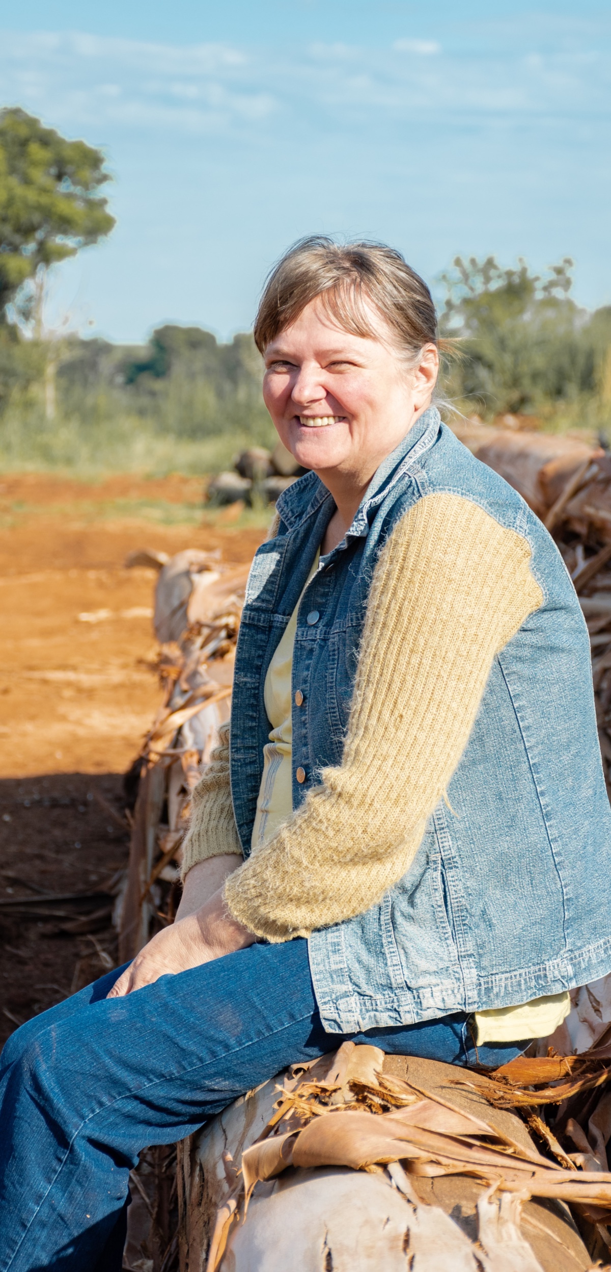
About
- Age: 45-54
- Status: Married
- Location: Boise, ID
- Occupation: Landscape Designer
- Interests: Gardening, mountain biking, spending time with her grandchildren
Personality
- Flexible
- Free spirited
- Nature-lover
Quote
I generally do not like camping anywhere there are generators because they are so loud, so I would shy away from that.
Goals
Being a self-employed landscape designer means she has a bit more time on her hands depending on the time of the year. Audrey takes her pop-up camper on the road for longer trips. She likes dispersed camping to connect more with nature, surround herself with trees and enjoy the quiet. She likes to do some research about an area before deciding whether she wants to visit by looking at reviews and photos.
Pain Points
Audrey sometimes finds it hard to get a feel for the area before camping. She would like there to be more information about dispersed camping areas. She also tends to stay away from RV sites as generators are often too loud.
JOBS TO BE DONE
I created five jobs to be done based on the user personas. User goals, entry point, success criteria, and tasks involved were also defined. The sixth job to be done was added after realizing a vital functionality was missing during the usability tests at a later stage.
- Find campsites based on the user criteria
- See search results listed and on a map
- User exports the location to a GPS app
- User submits a campground to be added to the web-app
- User submits a review to be added to the campground page
- User submits a report to change or update a campground page
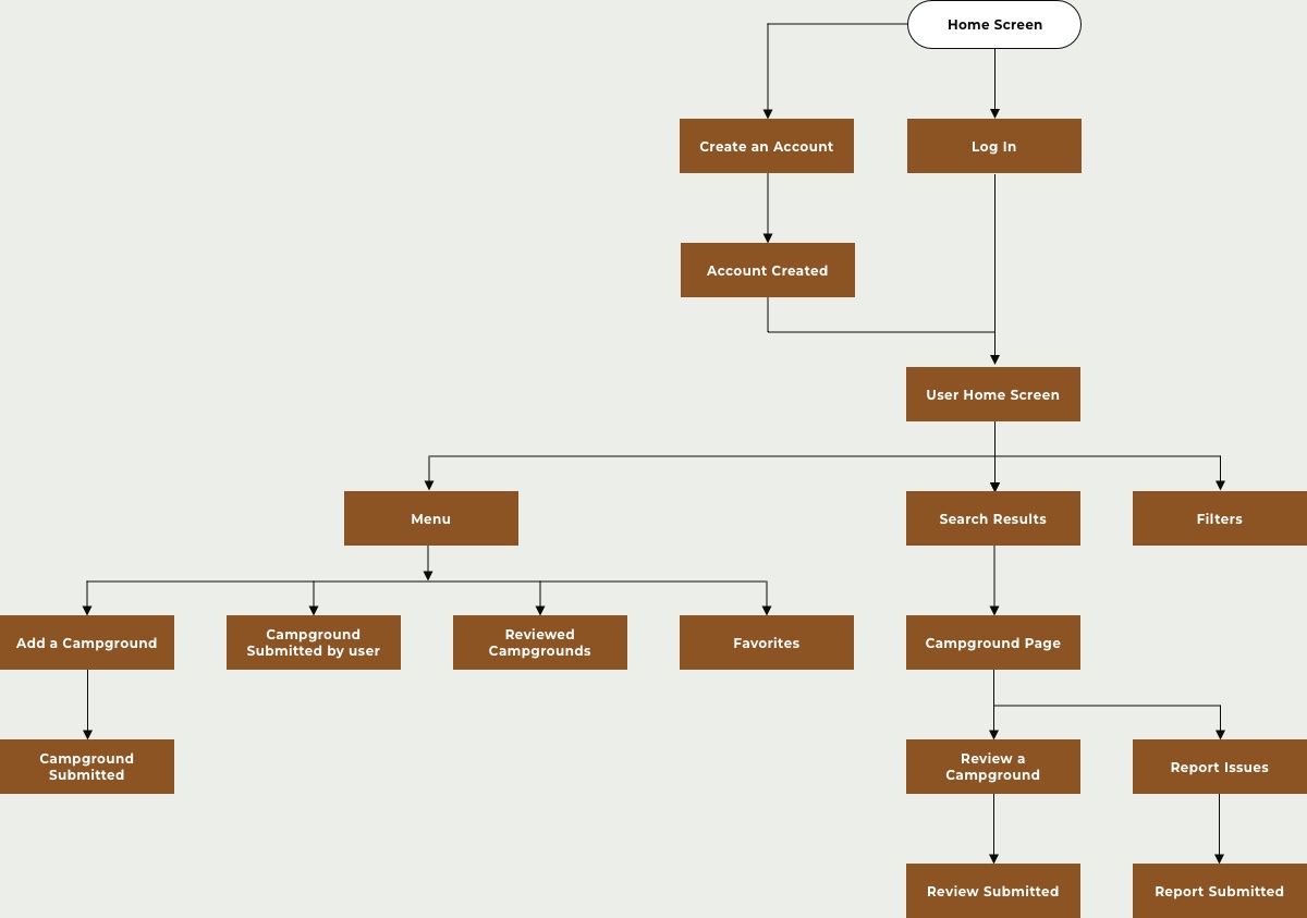
USER FLOW DIAGRAM
EXPLORATORY SKETCHING
Low-fidelity Wireframes
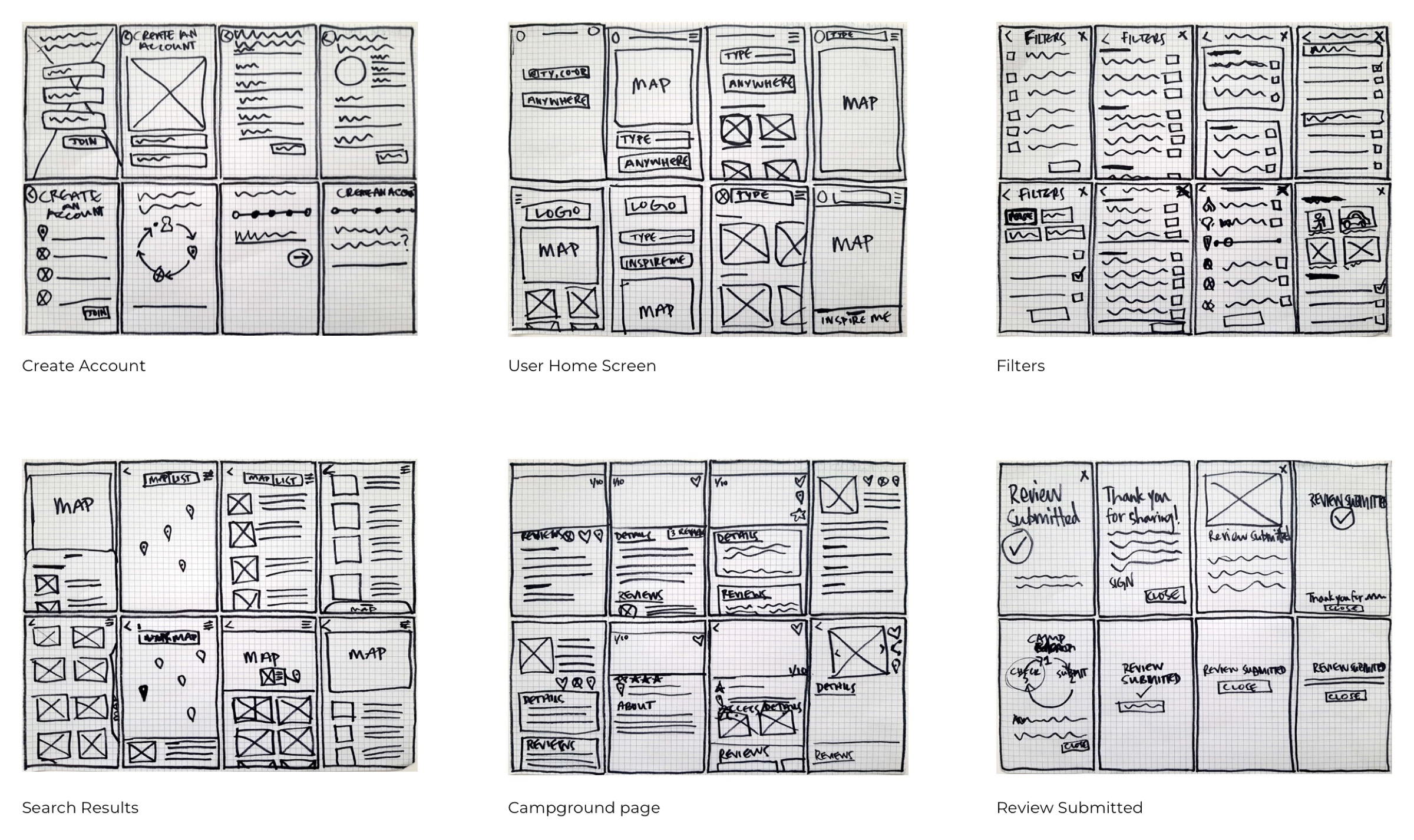
I used the Crazy 8s rapid exploratory sketching method to create low fidelity wireframes. The images showcase different layouts of screens. After refining some of these sketches, I put together a prototype and conducted usability tests on potential users
USABILITY TESTING
Aim of Testing
I created a rapid prototype and tested these on three participants. The aim was to get user feedback early in the project and ensure the features and flow worked for the user.
Results Synthesis and Error Rating
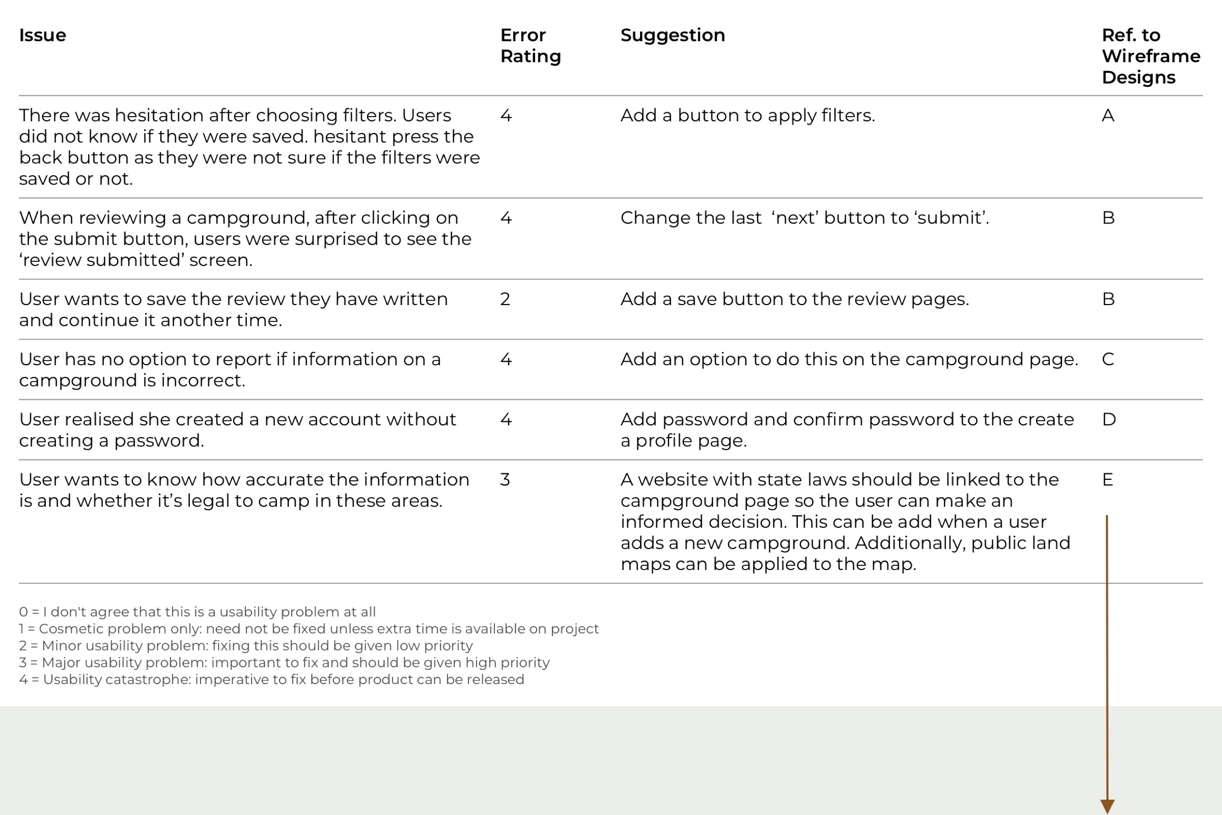
Table shows errors during usability testing, error ratings showinging severity of the issues, and proposed solutions for my designs.
Outcome
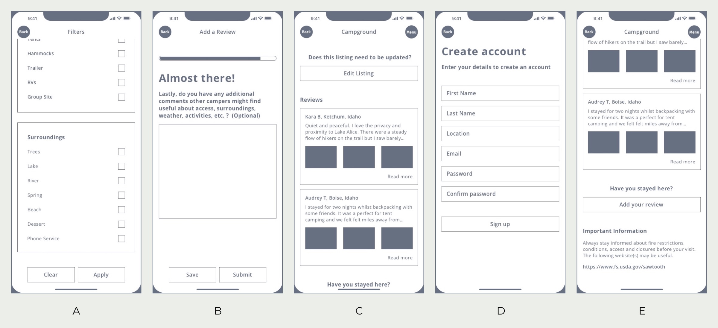
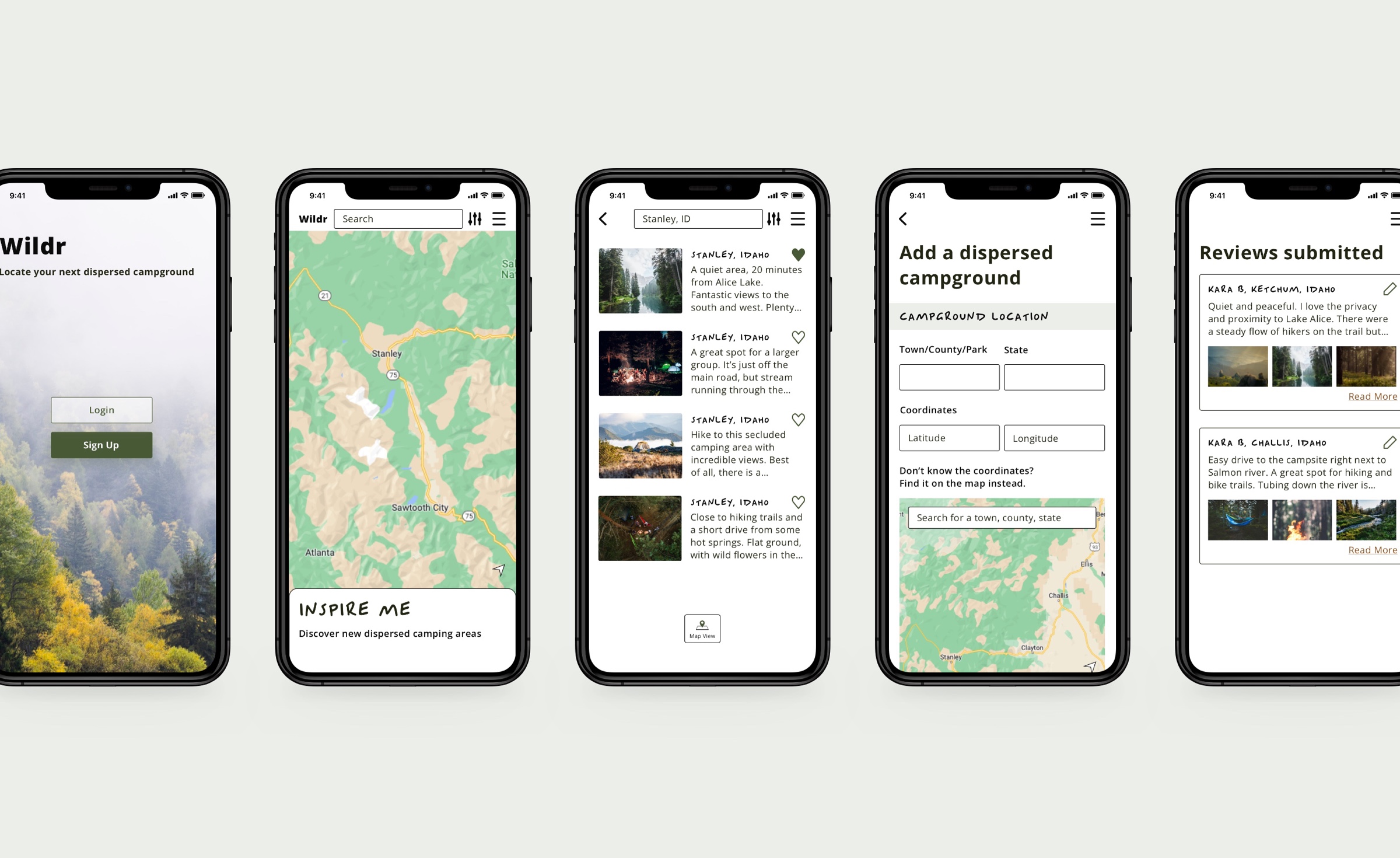
This sample of mid-fidelity wireframes show suggestions from the table above applied.
A/B PREFERENCE TESTING
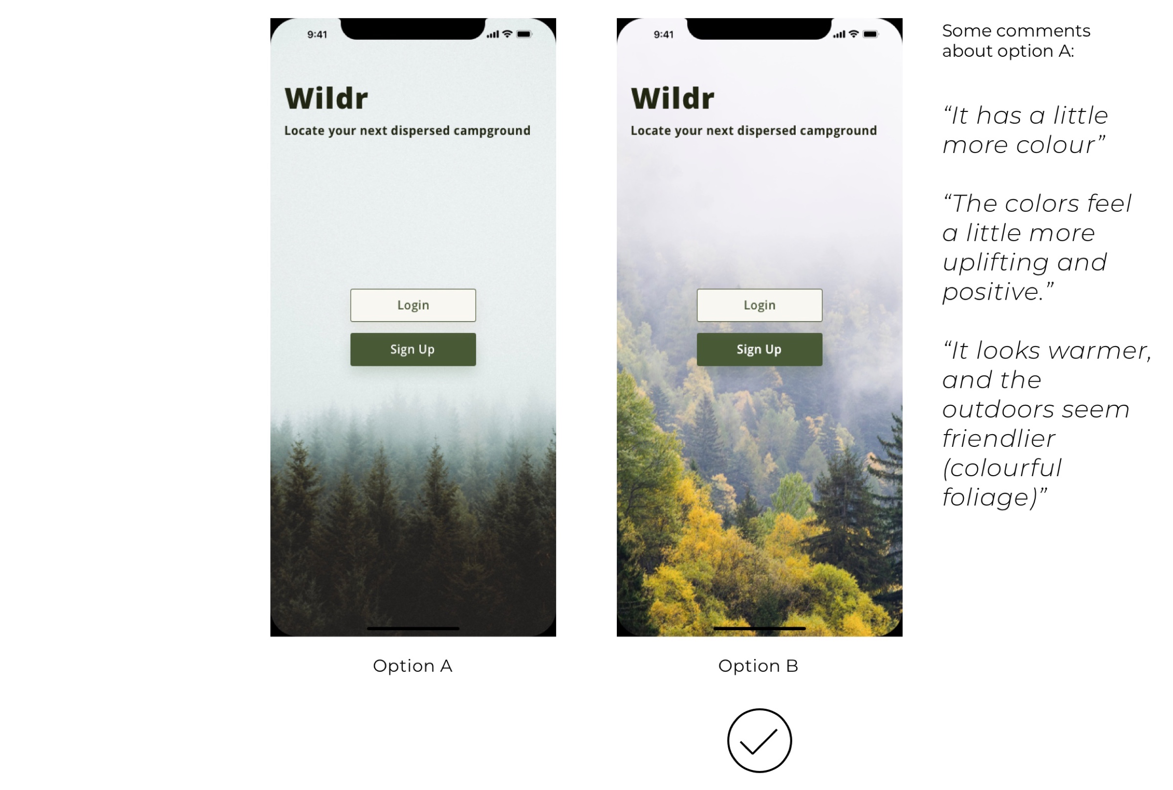
Testing Two Mobile Homepage Designs
The results were 50/50. I went with option B as it went well with the color palette and most testers commented the colors are more inviting.
STYLE GUIDE
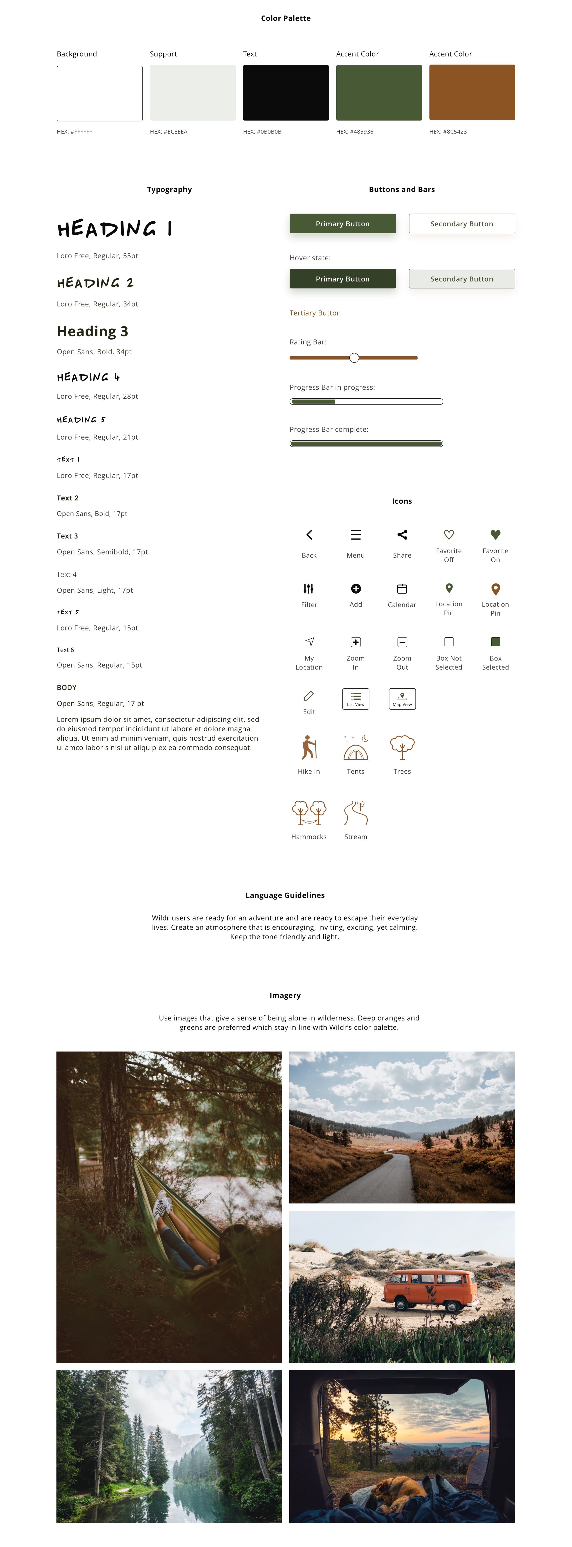
RESPONSIVE DESIGN
Custom Breakpoints
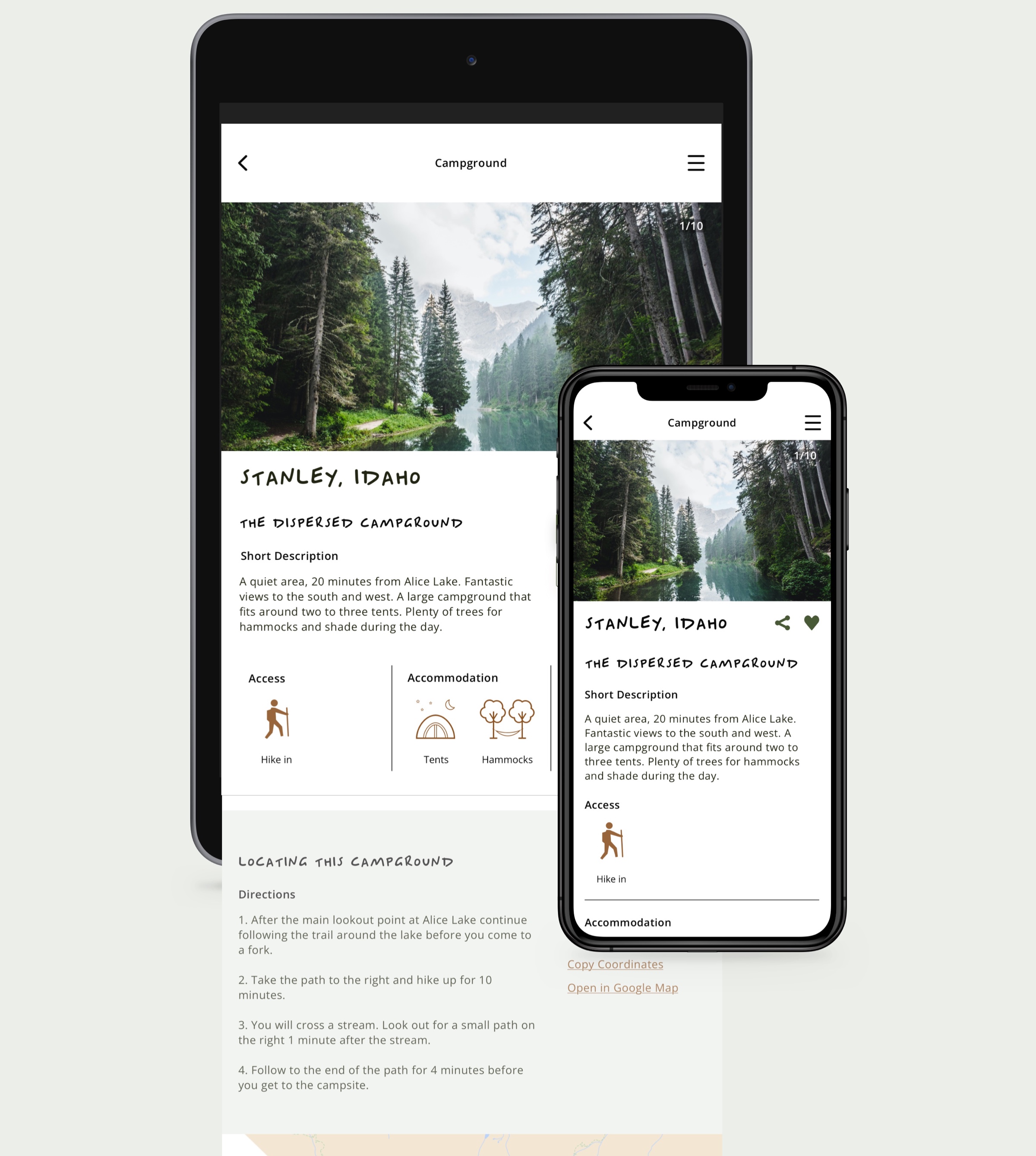
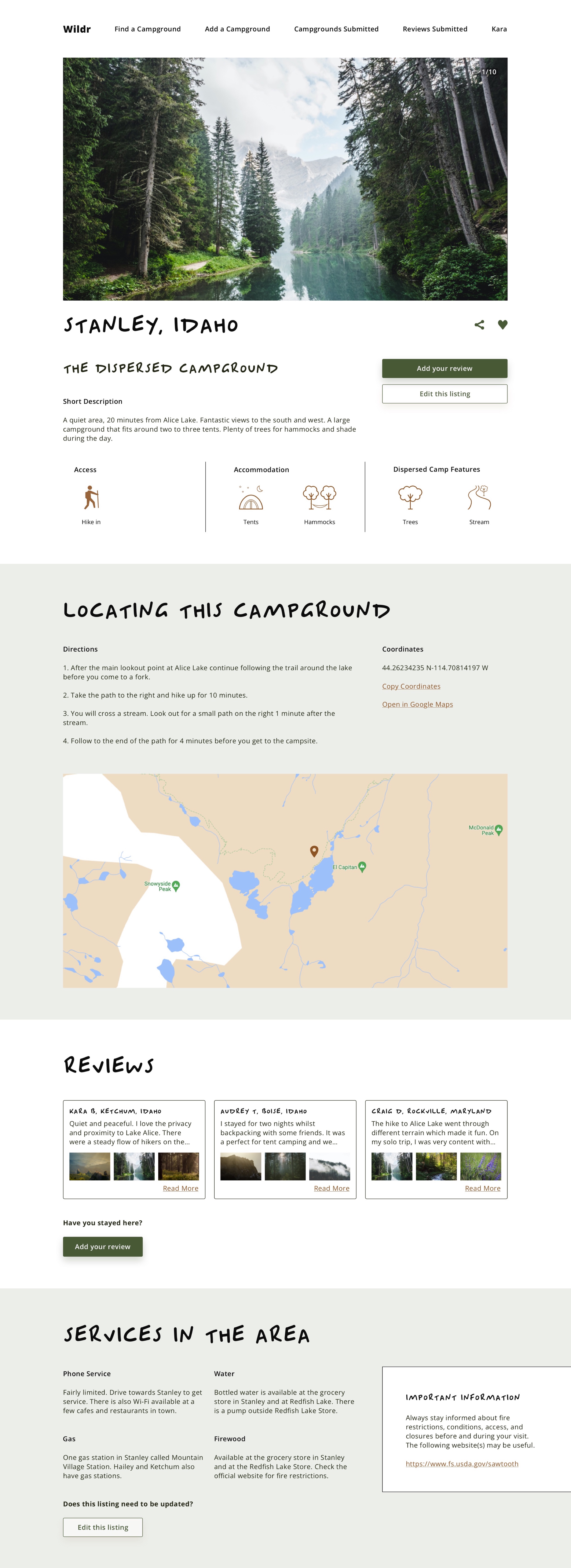
I created custom responsive breakpoints for mobiles, tablets and two larger screens for laptops and desktops. Setting up the responsive layout grids enabled me to fully understand how to manually calculate grid layouts.
Tablet and Mobile View
Desktop View
REFLECTION
My Role
I managed and carried out both the UX and UI design phases in this project.
This included performing UX research and tests; applying lean UX design principles to the design process such as exploratory sketches for low fidelity wireframes; creating user flows, wireframes, mood boards and a style guide.
After a critiquing session, I finalized my style guide and designs accordingly.
Take Aways
Get testers involved frequently is important. As a designer, it is best practice to take a step back and involve potential users and members of the design team.
This can alter your design choices like in the A/B preference testing in this project, I went with what users had a better impact.
User research interviews gave me an understanding of what was missing in current apps, and I was able to form an MVP objective and feature requirements for the responsive web app.
I also gained a good understanding of calculating and setting up responsive layout grids.